Case study
Rebuilding Chandrima’s store, from first look to the bag
Chandrima is a womenswear label from New Delhi and my first freelance client. I built their lookbook site in 2020, then their first online store on Gatsby in 2021. It showed the clothes well, but gave shoppers little help finding a piece, choosing a size or trusting the total. In 2026 I rebuilt it on Shopify Hydrogen.
- Role
- Design and development
- Client since
- 2020
- Before
- Gatsby on Netlify
- Now
- Hydrogen on Shopify Oxygen
- Conversion after the Hydrogen launch
- +14%
- Annual revenue after the Hydrogen launch
- +37%
The homepage, before and after


Drag to compare the old homepage with the new one.
The shopper’s path
What changed at each step
01 / 04
Arrive
Is this for me?
Before
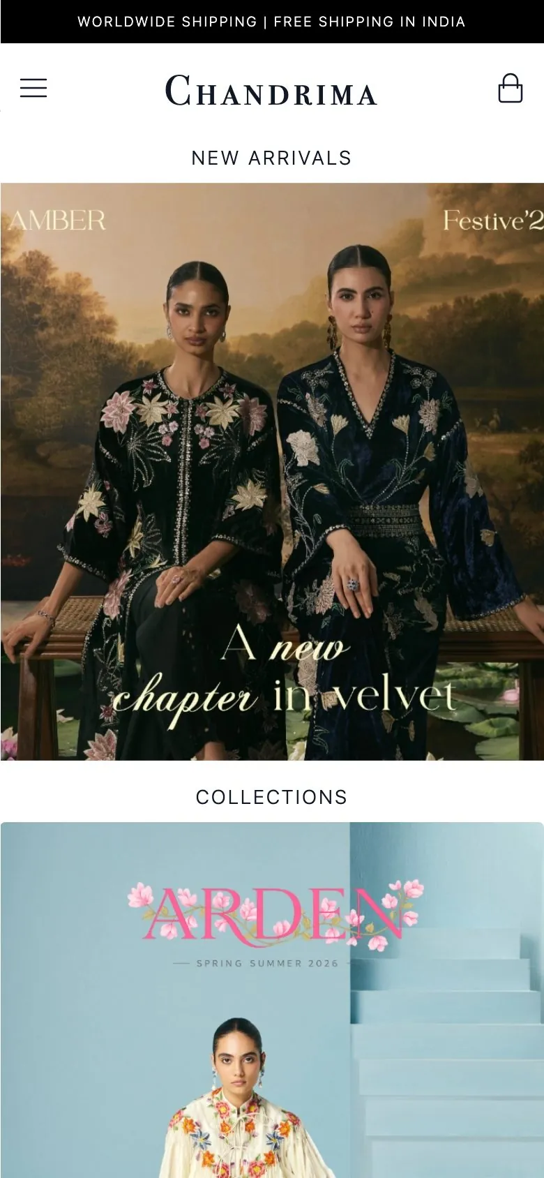
A rotating banner, then grids of collections, categories and celebrity looks. Every shared link showed the same preview card and pointed back to the homepage.
Now
- The campaign film opens the homepage, cut 16:9 for desktop and reframed 9:16 for phones.
- A shared product or collection link previews with that piece’s own photo.
- Campaign links can carry a discount code and land on any page.
Most visits start from a shared link, a search result or a campaign, so the first page a shopper sees often isn’t the homepage.
Before 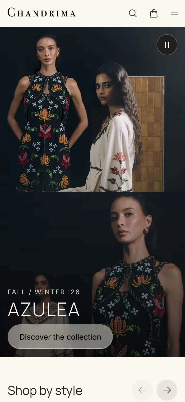
Now 02 / 04
Browse
Where is the piece I want?
Before
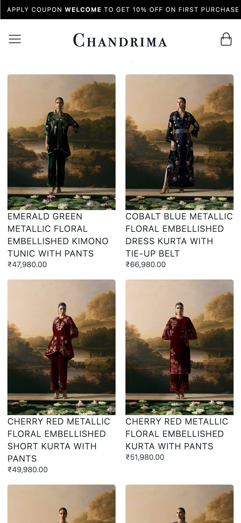
No search and no filters, and every price in rupees. Adding a category meant a code change.
Now
- Search suggests products as you type. On phones it opens with the keyboard already up.
- Collections filter by type, price, size and availability, and can be sorted.
- Categories come from Shopify, so Chandrima’s team can add one themselves.
- Prices can show as an estimate in the visitor’s own currency.
Before 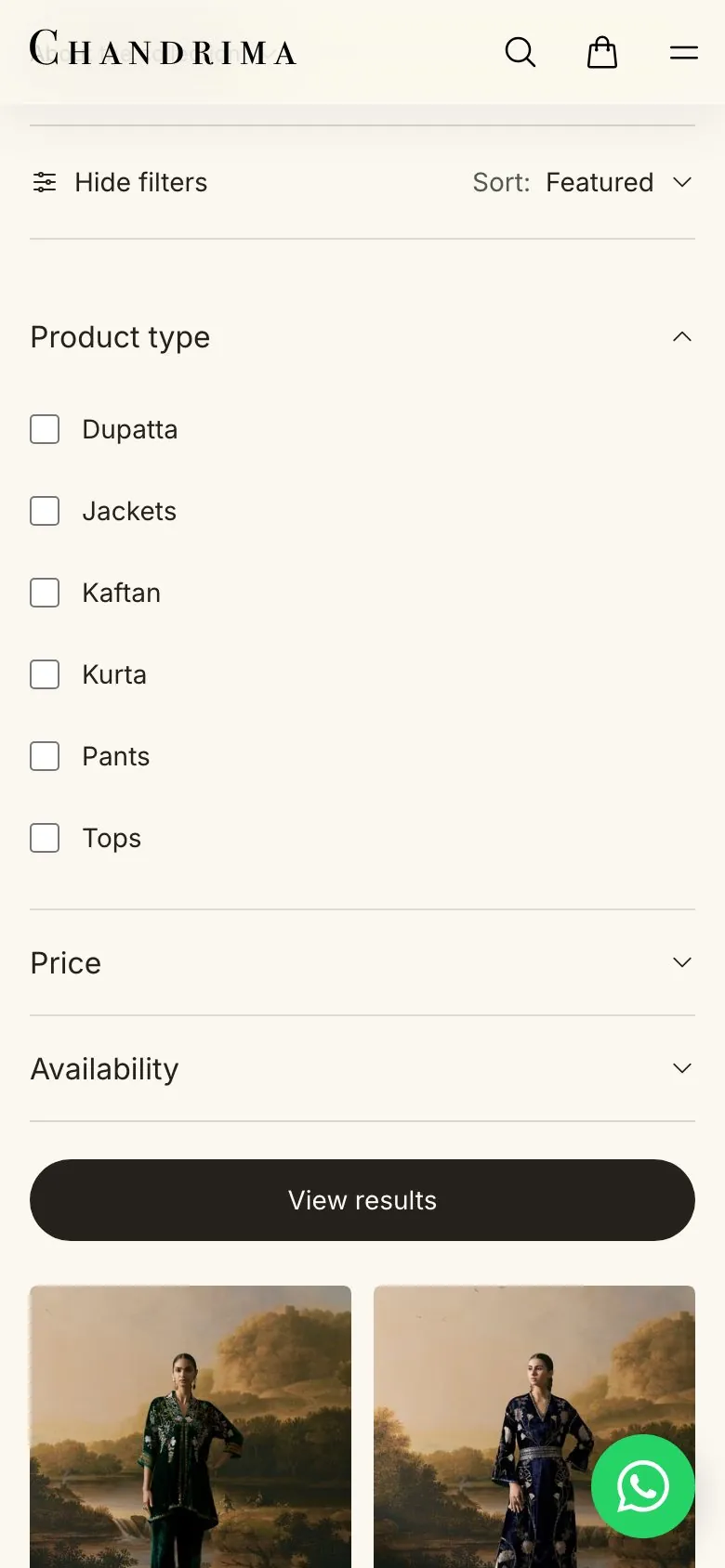
Now 03 / 04
Decide
Will it fit, and when will it arrive?
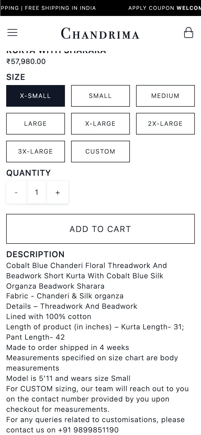
Before
Photos, sizes and an Add to Cart button, with the first size already selected, so it was easy to add the wrong one. The size chart was an image at the bottom of the page, and every product said “Made to order”, whether it was or not.
Now
- A size guide sits beside the sizes, with measurements in inches or centimetres.
- Until you pick a size, the button says “Choose a size”, not “Add to bag”.
- Dispatch timing comes from each product, with delivery and returns links beside the button.
- On phones, a purchase bar appears once the main button scrolls out of view.
Before redesigning this page I audited five other Indian designer storefronts. Several put fit help and dispatch times right next to the buy button.
Before 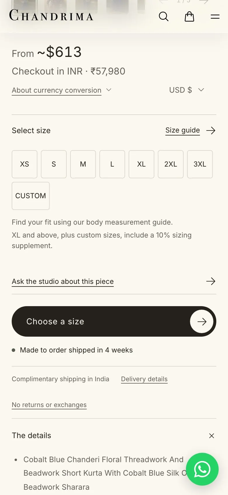
Now 04 / 04
Bag
Is the total right?
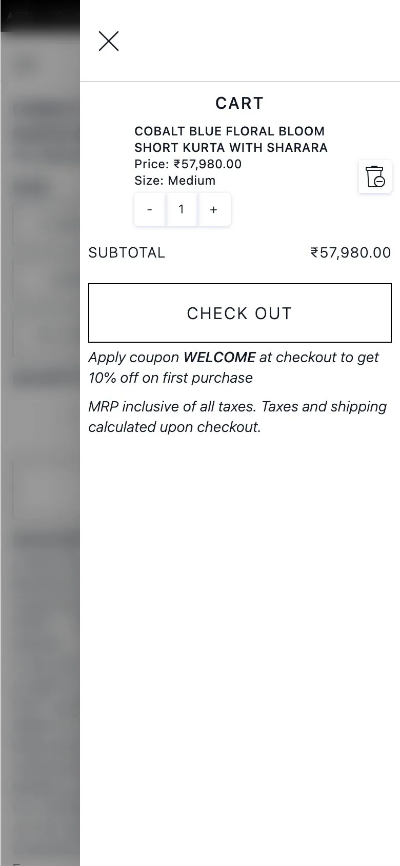
Before
The site showed sale prices as a flat 20% off, while the real discount was applied separately at checkout. An empty cart was a dead end.
Now
- Discount codes and gift cards apply in the bag, and each saving is listed.
- Changes show straight away while Shopify confirms them, and checkout waits until they’re done, so the total you pay is the one you saw.
- When prices show in another currency, the bag says checkout is in rupees.
- An empty bag links back to the collections.
Before 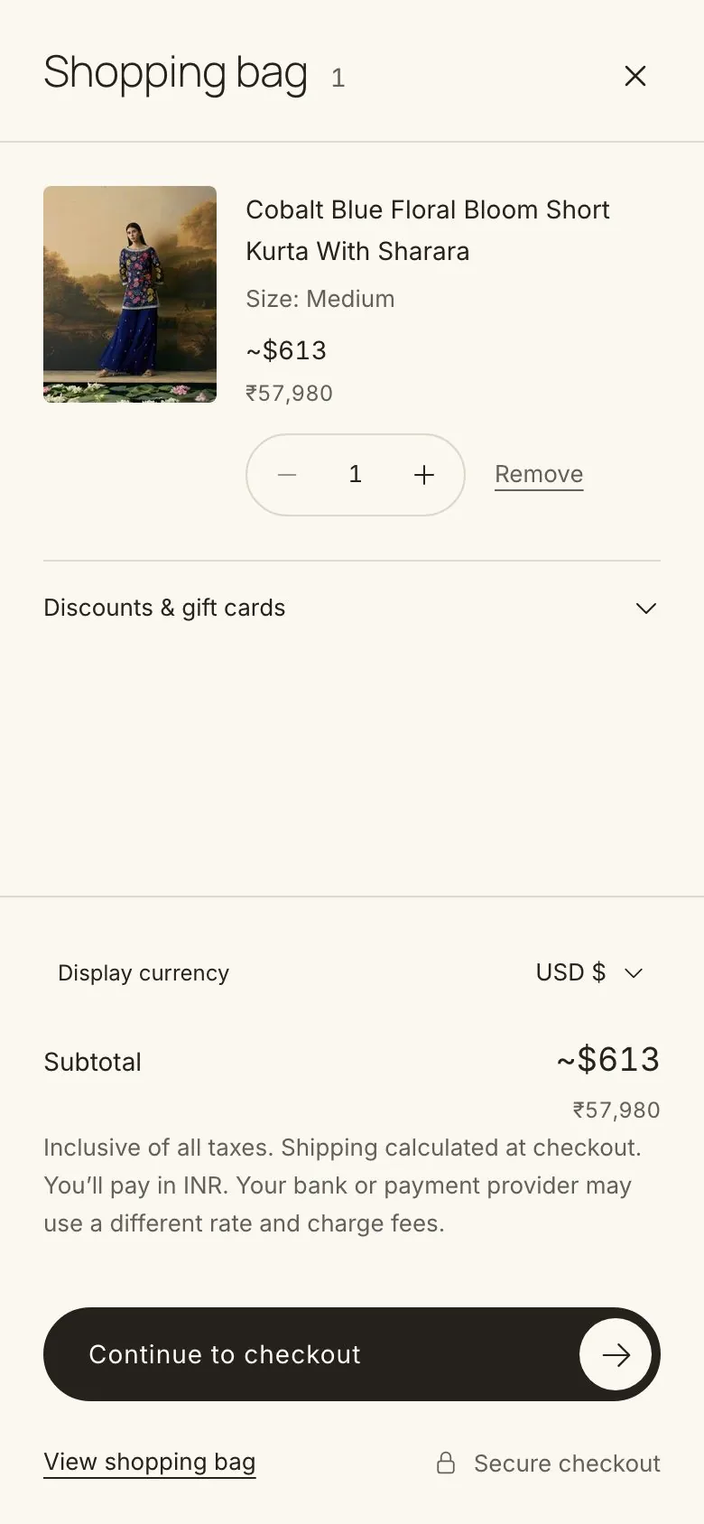
Now
Also in the rebuild
Cart API
The old store’s cart ran on shopify-buy, an SDK Shopify deprecated in January 2025. The new store uses the Cart API that Hydrogen supports directly.
Tracking consent
Analytics and ad trackers load only after Shopify’s Customer Privacy API reports consent, following each region’s banner rules.
Shopping events
The old store reported three shopping events. The new store reports six, from viewing a collection to removing something from the bag.
Newsletter, WhatsApp and gift cards
A newsletter that saves consent to Shopify, a WhatsApp shortcut for fit questions, and digital gift cards that can be sent on a chosen date.
Contact
Tell me what you’re working on.
A couple of lines is plenty. What is it, and when do you need it?
Divyansh Kaushik · Design engineer in Chicago, freelancing on the side.